A gallon of regular gasoline hit a statewide average of $4.196 on Thursday, up about 13 cents in a week, according to AAA. That’s the highest price since March 2013….Problems at a few refineries in the Golden State undergoing routine spring maintenance have squeezed inventory and boosted prices, analysts said. And only a handful of refineries outside the state are capable of making the ultra-clean type of gasoline mandated in California.
“A couple of refinery issues have started to flare up, which is fairly normal this time of the year,” said Patrick DeHaan, senior petroleum analyst at GasBuddy.com, a fuel price tracking website.
I used to keep a file of clippings of this exact same story running each spring and summer. I mean, literally the exact same story. Every year, right at the point where the winter/summer switch squeezes supplies from out of state, there would suddenly be a bunch of “glitches” that took some local refinery capacity offline and prices would spike.
I haven’t bothered with that for a while, but seeing this story today brought back memories, so I just thought I’d share. It’s an amazing annual coincidence, isn’t it?
Drum was probably writing tongue-in-cheek back in April 2014, but explaining refinery rules (rules of physics, not law or theoretical models) also will answer questions about a more recent price spike:
Because of special formulation requirements, California gasoline is always more expensive than gasoline in the rest of the country. As you can see, from 2010 through 2015 it averaged about 36 cents more per gallon.
In February 2016, an explosion at a refinery in Torrance took 10 percent of California’s capacity offline. As you’d expect, prices spiked: the California premium went up to about 76 cents above the national average.
But when the Torrance refinery came back online, a funny thing happened: prices came down, but not to their previous level. For some reason, California gasoline now costs about 57 cents more than the national average. Here is Michael Hiltzik in the LA Times:
Estimates of the size of the mysterious premium in prices per gallon being collected by the state’s refineries range from at least 20 cents per gallon — as calculated by UC Berkeley energy economist Severin Borenstein — to more than 30 cents, as reckoned by the advocacy group Consumer Watchdog.
….Soon after the Torrance explosion, the California Energy Commission asked its Petroleum Market Advisory Committee to analyze the event’s price impacts….The report mentioned an “unexplained differential” between prices in California and the national average that persisted even when the unique features of the state’s gasoline market were subtracted….Californians appeared to have paid an extra $12 billion at least since the 2015 Torrance explosion.
….The Petroleum Market Advisory Committee didn’t assert that there was anything illegal about the persistently high gas prices after the Torrance explosion. But it was convinced that the extra money was going to the refineries, because their margins — that is, the difference between their cost for crude oil and the wholesale price they charge for gasoline, had “remained elevated for an unexpectedly long time” after the explosion.
The refinery lobby claims the increased premium is just due to market forces, “as well as our state being a fuel ‘island,’ without pipelines bringing refined petroleum products into California.”
Drum is clearly familiar with EIA data as his graph sources the Energy Information Administration, but it would benefit him to become fluent with the Refining and Processing Tab under the EIA’s Petroleum Data series. Lobbyists often play fast and loose with the truth, but refinery capacity utilization in PADD 5 tells the entire story:
2016-Jan
01/01
88.2
01/08
86.0
01/15
89.0
01/22
84.2
01/29
86.0
2016-Feb
02/05
84.5
02/12
83.3
02/19
84.3
02/26
82.6
2016-Mar
03/04
83.4
03/11
84.7
03/18
87.0
03/25
87.6
2016-Apr
04/01
87.6
04/08
86.6
04/15
90.2
04/22
88.4
04/29
88.2
2016-May
05/06
86.4
05/13
83.9
05/20
82.0
05/27
84.2
2016-Jun
06/03
86.0
06/10
82.6
06/17
85.8
06/24
91.6
2016-Jul
07/01
90.5
07/08
92.0
07/15
91.5
07/22
89.4
07/29
91.4
2016-Aug
08/05
90.1
08/12
92.8
08/19
93.1
08/26
92.1
2016-Sep
09/02
92.3
09/09
91.2
09/16
92.5
09/23
89.9
09/30
86.2
2016-Oct
10/07
84.7
10/14
76.1
10/21
76.9
10/28
76.2
2016-Nov
11/04
77.5
11/11
80.4
11/18
82.1
11/25
79.6
2016-Dec
12/02
80.6
12/09
80.0
12/16
80.9
12/23
79.7
12/30
86.1
2017-Jan
01/06
90.9
01/13
86.8
01/20
88.0
01/27
83.8
2017-Feb
02/03
87.0
02/10
79.8
02/17
82.2
02/24
81.3
2017-Mar
03/03
80.9
03/10
82.3
03/17
87.2
03/24
89.1
03/31
92.2
2017-Apr
04/07
95.0
04/14
92.4
04/21
91.9
04/28
88.6
2017-May
05/05
89.0
05/12
85.7
05/19
84.5
05/26
86.8
2017-Jun
06/02
87.7
06/09
86.0
06/16
86.0
06/23
85.5
06/30
86.2
2017-Jul
07/07
86.6
07/14
87.4
07/21
91.9
07/28
93.6
2017-Aug
08/04
91.3
08/11
92.6
08/18
92.0
08/25
91.9
2017-Sep
09/01
92.7
09/08
92.9
09/15
91.5
09/22
94.0
09/29
93.0
2017-Oct
10/06
88.3
10/13
81.5
10/20
81.9
10/27
81.4
2017-Nov
11/03
86.2
11/10
86.1
11/17
87.6
11/24
84.5
2017-Dec
12/01
91.1
The U.S. is divided into five PADDs (Petroleum Administration for Defense Districts, a holdover term from the Korean War period)–East Coast (PADD 1), Midwest (2), Gulf Coast (3), Rocky Mountain (4) and West Coast (5). PADD 5 is a “fuel island” in the sense that its refineries are not linked to Cushing, OK and thus have difficulty accessing WCS and WTI; unlike PADD 4 which has direct access to WCS with the Montana/Alberta border (and thus doesn’t need access to WTI) while PADD 2 and 3 have ready access to all North American supplies via Enbridge’s Mainline and Seaway pipelines and TransCanada’s Keystone Phase I, II, and III (Keystone XL is the marketing name for Phase IV). Moreover, PADD 3 supplies PADD 1 via the Big Inch and Little Inch pipelines.
California is by far the largest oil refiner in PADD 5, and the data reflects both increased capacity draws year-over-year after the 2016 explosion and the assertion of the 95% rule in April 2017, lest there be a rerun of the 1998 summer and fall debacle.
True, refineries are getting better at improving their margins, as seen when California’s schedule maintenance in the spring. But a quick look at capacity utilization shows that refineries tend to have the greatest slack capacity between the end of winter and the beginning of the spring/summer driving season. Maintenance makes sense when utilization stands and 80% instead of 95%, doesn’t it?
The chief issue is the geniuses at the Chicago Mercantile Exchange (CME), which owns NYMEX to boot. CME raises the price of Brent and WTI as a result of refinery maintenance, which suppresses demand because, as we always remind readers, refineries are the only customer for CRUDE oil. Low demand (slack capacity utilization) leads to maintenance, leading to higher refinery input costs until gasoline/diesel/jet fuel demand picks up. Brilliant system CME has there.
And Now, For Something Completely Different
PAR specializes at a certain branch of the economy, but we were caught by another curious observation from Kevin Drum:
If the rich squirrel away their income instead of spending it, then total national consumption will be highest when the non-rich have a bigger share of total income. As Bivens says: “A straightforward back-of-the-envelope estimate of [blah blah blah]. Table 2 shows the results of this procedure.” Long story short, Table 2 shows that total national consumption is about 2 percent lower than it would be if income inequality hadn’t risen since 1979.
So far, so good. But there’s always been a big problem with this theory: if the rich save more of their income, this implies a higher overall savings rate as income inequality rises. But that’s not what happened: From 1980 through the early aughts, the savings rate dropped:
Bivens agrees this is a problem for the inequality hypothesis, but suggests that it’s something of an illusion because normal measures of saving don’t include unrealized capital gains, a substantial source of household net worth for the rich. If you include that, the savings rate looks different:
It’s true that there’s more volatility in this measure, but in fact it doesn’t look much different from the standard savings chart. Once you fit a trendline, you get the same result: savings decreased from 1980 through the mid-aughts.
Unrealized capital gains don’t represent reduced spending from current income, so I don’t know if Bivens’ approach is kosher in the first place. Unfortunately, it’s not clear if that matters since it doesn’t change the overall trendlines anyway. The hypothesis that increased income inequality reduces overall demand remains one of those tantalizing theories that seems like it’s obviously true, but just doesn’t fit the data. For the time being, I continue to think of it as one of our great mysteries.
Is this that mysterious? Really? We believe the answer is fairly straightforward–consumer debt has largely replaced income gains since 1983.
Inflection Point
From the beginning (January 1943) of the St Louis Fed’s consumer credit data series to 1980, there was a noticeable uptick in the second half of the 1970s:
(WARNING–FRED graphs have a tendency to embed improperly here, so to see the data a reader might have to go here and move the start/end dates).
The post-1975 uptick was almost certainly due to inflationary pressures, but the 1982 recession crushed inflation below 5.0% and a period of disinflation lasted from 1981 until 1986. But despite falling inflation, consumer credit ticked up again when the early-80s recovery asserted itself…
Correlation is not causation, but the negative effects of excessively turning to private debt are hard to discount:
Former Fed Chairman Alan Greenspan, discussing the financial crisis of 2008, wrote that “financial bubbles occur from time to time, and usually with little or no forewarning.”
That’s misleading at best. The 2008 collapse was predictable. And, more generally, major financial crises of this type can be seen well in advance—and prevented—if you know what to look for. In fact, there’s a fairly simple formula that predicts such crises with a high amount of confidence. And it suggests that the world economy remains in more peril than is generally appreciated.
This conclusion comes from an examination of financial crises around the world, dating back to the 19th century, that I conducted with my colleagues and summarize in my new book The Next Economic Disaster. The logic behind our conclusion can be seen in the diagrams below.
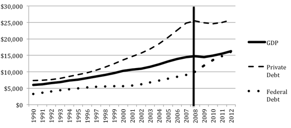
Take a look at this graph:
Crisis of 2007-2008: U.S. GDP, Public Debt, and Private Debt (in Billions)
GDP data comes from the Bureau of Economic Analysis, private-debt data from the Federal Reserve, and Federal-debt data from the Treasury. (Richard Vague)
Note that, in the years prior to the crisis, the line representing federal government debt roughly parallels the line representing GDP; federal debt wasn’t growing dramatically as a fraction of GDP. So the big post-crisis standoff between Democrats and Republicans over the federal debt wasn’t focused on the big problem.
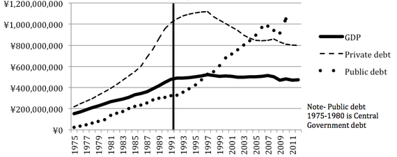
What was the big problem? Look at the line representing private debt. It clearly is not parallel to the GDP line and, indeed, reflects a rapid growth of private debt relative to GDP.By itself this isn’t shocking. We all know that a growth in home mortgages preceded the crash, and home mortgages are one kind of private debt—along with other consumer borrowing and borrowing by businesses. What’s more surprising is what we found when we looked at lots of other financial crises around the world, dating back to the 19th century: Though most of these crises aren’t thought of as being fundamentally caused by excessive private debt, the fact is that they were preceded by the same kind of runup in private debt that the U.S. saw prior to 2008. Just to take one example, look at this data from Japan prior to its financial crisis of 1991.
Japan Crisis of 1991: GDP, Public Debt, and Private Debt (in Millions of Yen)
Look familiar? Time and again, that’s the story we found: A major financial crisis is preceded by a runup in private debt relative to GDP. In fact, there seems to be only one other ingredient required for a crisis: that the absolute level of private debt is high to begin with. We found that almost all instances of rapid debt growth coupled with high overall levels of private debt have led to crises.
To put a finer point on it: For major economies, if the ratio of private debt to GDP is at least 150 percent, and if that ratio grows by at least 18 percent over the course of five years, then a big crisis is likely in the offing.
PAR was not involved in any way with the above, but we see a dangerous correlation when looking at the savings rate of the Japanese:
For the first time since records were collected in 1955, Japan’s population is drawing down its savings and the savings rate, calculated as savings divided by disposable income plus pension payments, was negative 1.3%.
It’s a dramatic change from when the Japanese saved nearly a quarter of their income (23.1%) when the savings rate peaked in 1975.
Japan had the highest household saving rate in the OECD in the 1960s until it fell to the lowest. After all, an aging population draws down savings and Japan is the fastest-aging country in the world; its population has been shrinking for a decade.
High private debt fueled by easy access to consumer credit clearly becomes destructive when coupled with a declining savings rate. The mechanism is almost certainly income replacement, which creates another disturbing parallel between the U.S. and Japan:
When Japan’s real-estate bubble burst, young people had no point of reference other than boom times. So when the job market dried up, many of them welcomed the chance for self-exploration. In 1990, the Los Angeles Times reported on these young freeters, who rejected “conformist Japanese culture and its 15-hour workdays” in favor of “working odd jobs for spare cash” and “hanging out.” The freeters pioneered funemployment.But while the term freeter stuck, the choice to be out of work was soon anything but free. The first freeters are now in their late 30s and early 40s. Almost one-third do not hold regular jobs, and some never have. One-fifth still live with their parents. This perpetual failure to launch has taken a psychological toll. Aging freeters file six of every 10 mental-health insurance claims. Japan’s suicide rate rose by 70 percent from 1991 to 2003, and the proportion of suicide victims in their 30s has grown each of the past 15 years.What is most alarming is that things keep getting worse for subsequent generations. Today, more than 20 years after Japan’s bubble burst, youth unemployment is higher than ever. Only half of working 15-to-24-year-olds have regular jobs, and another 10 percent are unemployed. The rest are “nonregulars.” Somewhat akin to temp positions in the U.S., Japan’s nonregular jobs pay half as much as regular jobs, offer few benefits, and can be eliminated on a whim—which they often are. The portion of young Japanese working as nonregulars exploded in the mid-1990s and has marched upward ever since.After years of profit pressure, Japanese companies have all but stopped hiring regular employees, and most young job-seekers must choose between an unstable job and no job at all. The companies claim they are just reacting to the weak economy: sinking profits call for cost control, and nonregulars are both cheap to employ and easy to fire.
Freeter, which to older Japanese generations has become synonymous with “slacker,” has crossed the Pacific as “slackoisie” in legal circles and a general disgust with the generation born between 1982 and 2000. Much of the invective directed at the young of Japan and the U.S. probably stems from the age-old mistake of confusing young people’s lack of experience instead for a sea change in cultural and economic mores, but the “slacking” phenomenon is also most likely driven by dangerous economic doctrine.The brief reduction in consumer credit availability after 2008 has given way to the unrelenting upslope that has began almost 35 years ago, and wage increases are barely keeping pace with inflation. Speaking of which…
On Inflation
Drum is eager to find the reason for persistent “lowflation,” as Paul Krugman terms it. He hits on the historical oddities:
For most of the 20th century, inflation was low. Then, starting in the late 60s, it climbed steeply for about 15 years, peaking around 1980. Then it spent the next 15 years declining to its old rate. Here’s what it’s looked like since then:
Core inflation—the Fed’s preferred bellwether—has been dead flat for 20 years. It hasn’t been very noisy, either, staying tightly within a band of 1-2.5 percent. It’s maintained this level through recessions and expansions, through war and peace, and even during the tight labor market of the late 90s. For a while, it was globalization that was supposedly to blame. But even after the China shock had mostly passed, inflation stayed low. So then it was because of retiring boomers. Or maybe the Great Crash of 2008. Then came the subsequent expansion, and inflation still remained quiet. So then it was because even though unemployment was low, the labor market was too loose. But now the labor market is starting to genuinely tighten, and inflation is going nowhere. So we’re adding web-based comparison shopping to the list.
Come on. If web shopping has constrained the ability of companies to raise prices, you’d expect corporate profit margins to be down. But they aren’t:
Granted, this shows profit margins for all corporations, and web shopping only affects a subset of consumer products. Still, you’d expect to see something. Instead, starting around the time smartphones took off, what we see is higher margins. They’re now at their highest point in 50 years.
I’m not smart enough to know what’s going on. But when inflation has stayed flat so widely and for so long, it’s hardly credible that it’s the result of a bunch of factors that have coincidentally followed one after the other. There’s something more fundamental going on. And this something has been at work for at least 20 years, and probably more like 30.
I’ll toss out one possibility that I think gets too little attention in general. The late 60s and 70s, when the world truly left the gold standard and opened up financial markets, represented a massive financial sea change that neither governments nor central banks were prepared to deal with. Add in a couple of oil shocks and the global economy became unmoored. It took years for financial rules to adapt and for the major central banks to learn from experience what they had known only academically before. But then they learned. They’re nowhere near perfect, but ever since the late 80s they’ve been surprisingly good at dealing with recessions and expansions—and just generally keeping the economy on an even keel. The result is that inflation is roughly as quiet as it was for most of the 20th century until the mid-60s.
Feel free to leave your own guesses.
The short answer to the lowflation puzzle is the zero-lower-bound. Contrary to most historical records, the U.S. hit the ZLB around or before the turn of the millennium:
The market had gained a great deal of value in the year of 1987. After the crash in October it quickly began to make back lost ground and by the end of the year the market was at virtually the same level as the beginning of the year. No one thinks that the economy is affected in any significant way by short-terms movements in the market, so there was really nothing to clean up in this story.
The picture was very different following the 2001 crash which resulted in the elimination of roughly $10 trillion in stock bubble wealth, an amount approximately to the economy’s GDP. The economy did not recovery quickly following this crash. While the recession was officially short and mild, ending in 2001, the economy did not begin to create jobs again until the fall of 2003, almost two years after the recession was over. It did not get back the jobs lost in the recession until January of 2005. At the time, this was the longest period without job growth since the Great Depression.
The Fed seemed to take notice of the weakness of the economy keeping the federal funds rate at just 1.0 percent until the summer of 2004. This can be seen as effectively the zero lower bound. No one thinks that there is any great stimulatory effect from dropping the rate from 1.0 percent to zero, which is why people routinely talked about the European Central Bank as being at its zero lower bound even when its overnight interest rate was 1.0 percent.
Of course even when the economy did finally bounce back it was on the back of the housing bubble, which was not a very stable course. In other words, if Greenspan thinks he can point to evidence that the economy recovers quickly from the collapse of asset bubbles it is only because he is very confused about basic economic facts.
But Drum’s thoughts deserve a more thorough dissection of the history of inflation and CPI, especially his thoughts on the end of the gold standard. What the hell, we’ll do precisely that in the next PAR posting.